Surreal Brewing
branding/ visual identity / packaging
Case Study
Surreal Brewing is a non-alcoholic craft beer brewery that was founded by the husband-and-wife team, Tammer Zein-El-Abedein and Donna Hockey. After Donna's breast cancer diagnosis and successful treatment left them disappointed with the non-alcoholic beers available, they set out to create their own flavorful and innovative brews. Surreal Brewing's commitment to excellence has been recognized with numerous awards, including accolades for their outstanding taste, quality, and creativity. With a passion for brewing and a dedication to pushing the boundaries of what's possible in the realm of non-alcoholic beer, Surreal Brewing has become a trailblazer in the industry, offering a refreshing and flavorful alternative to traditional beer that has garnered widespread acclaim.


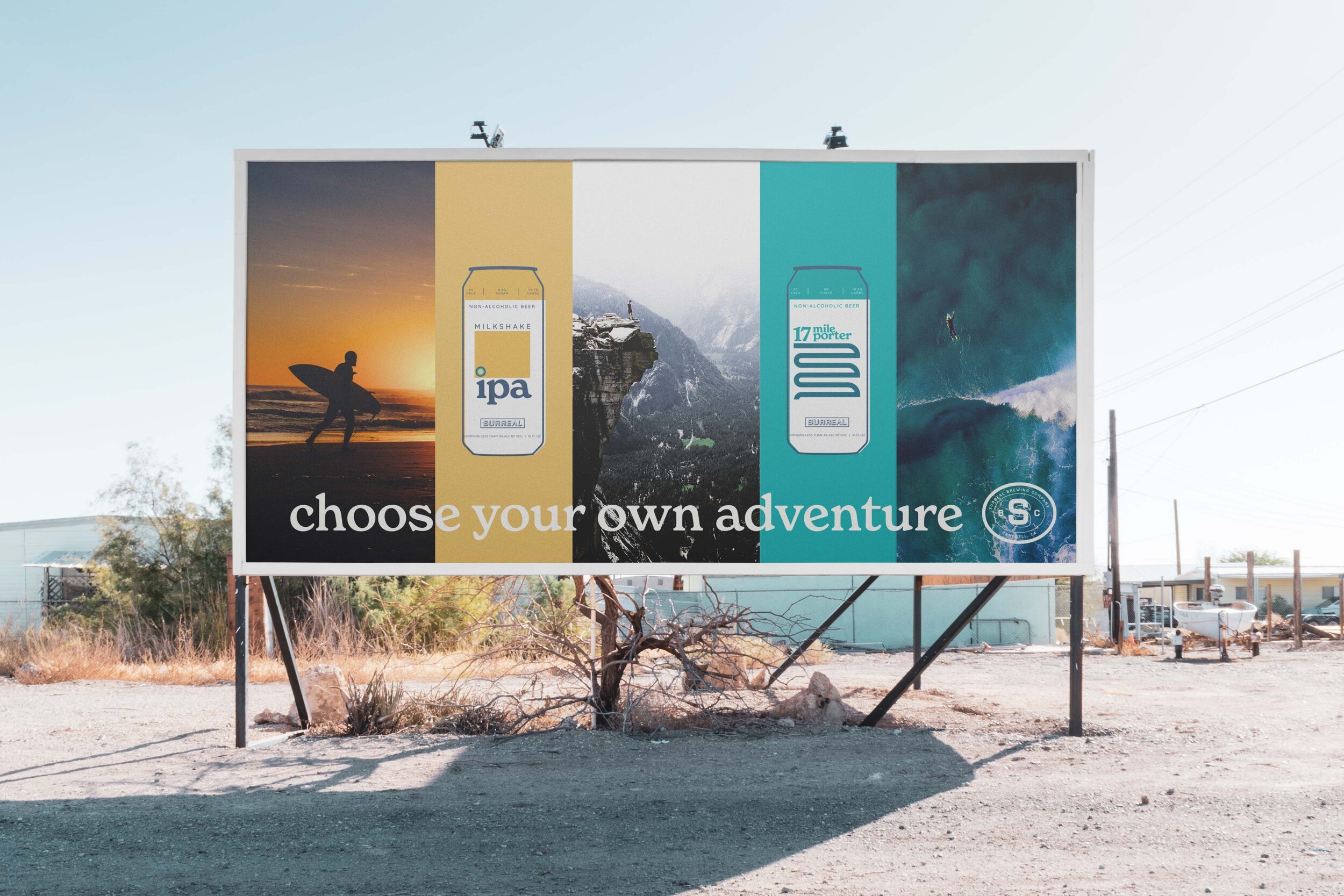
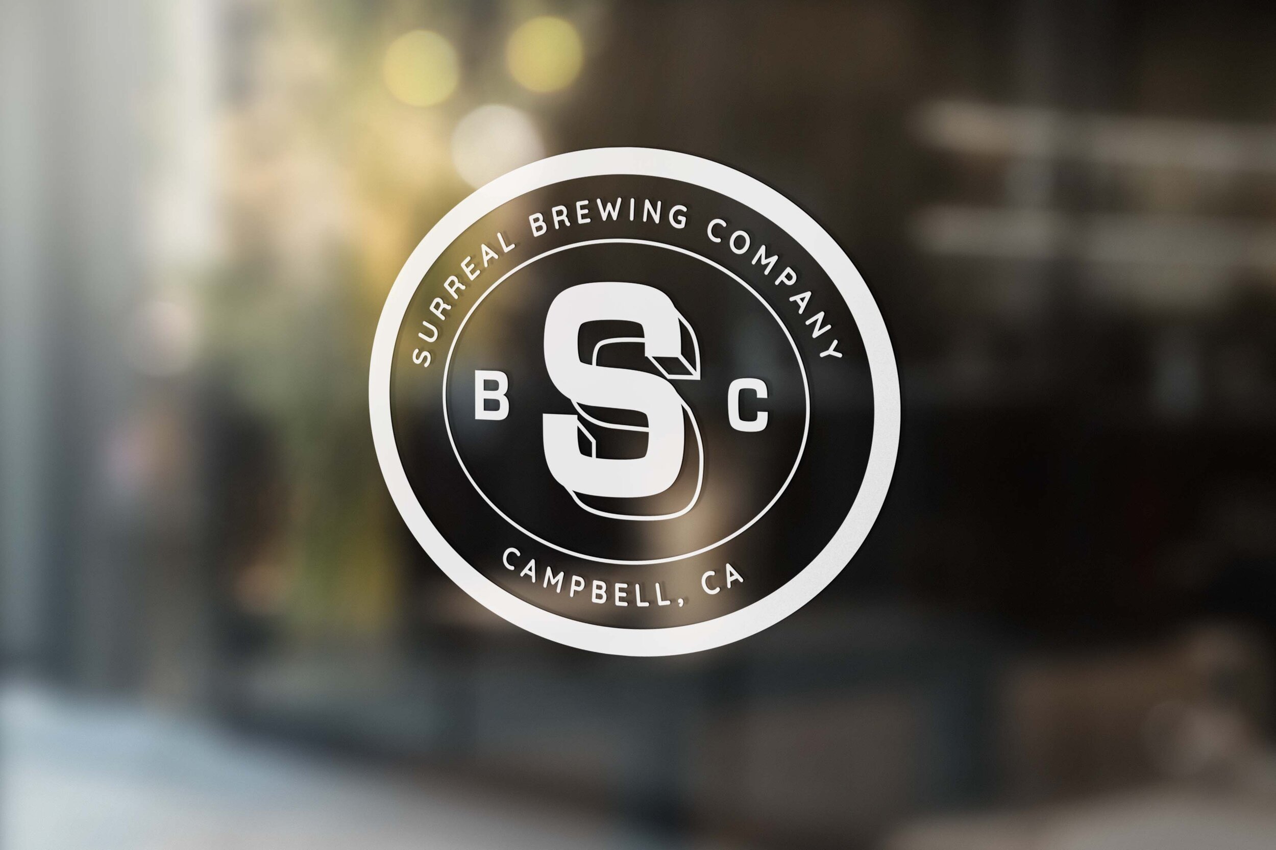
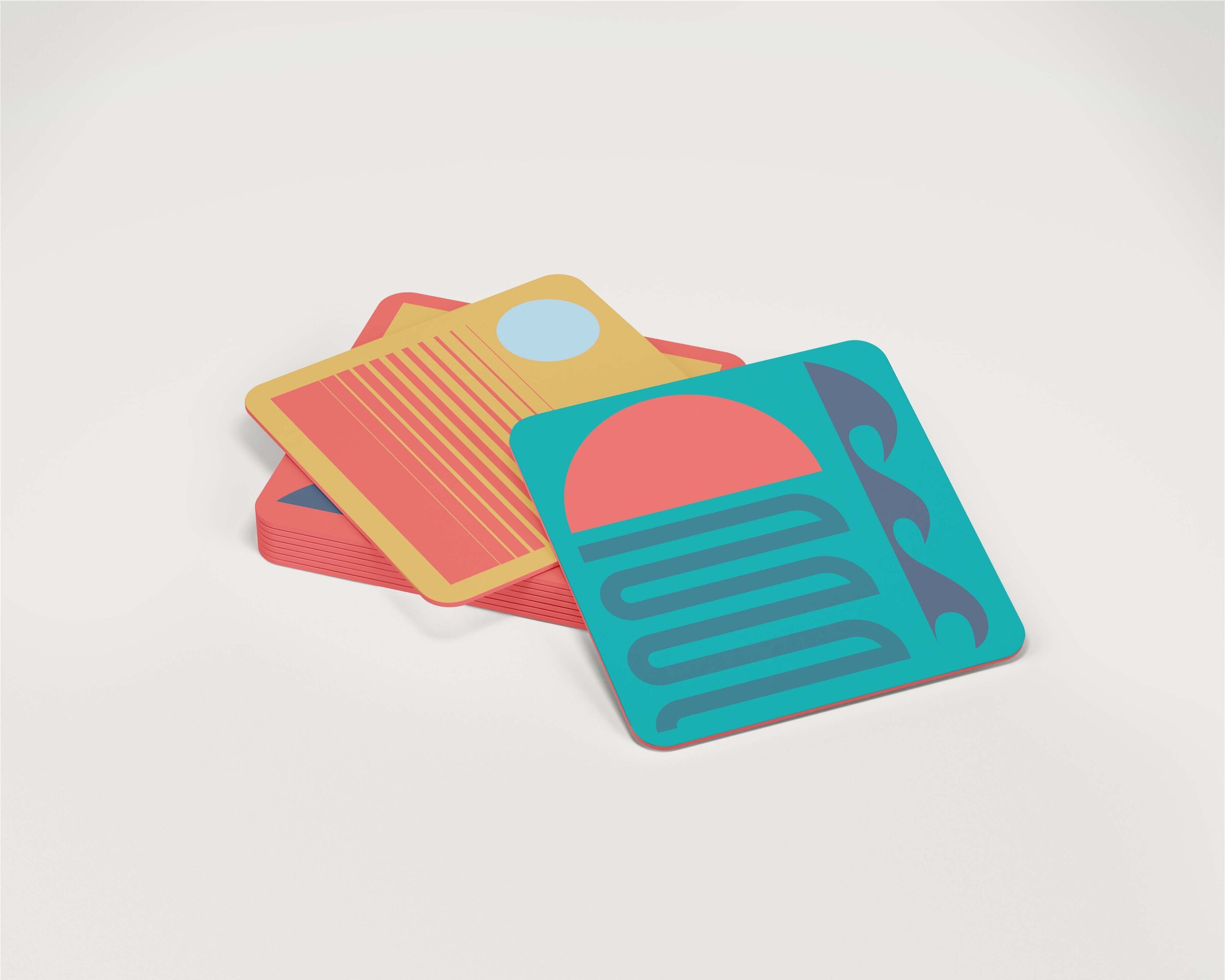
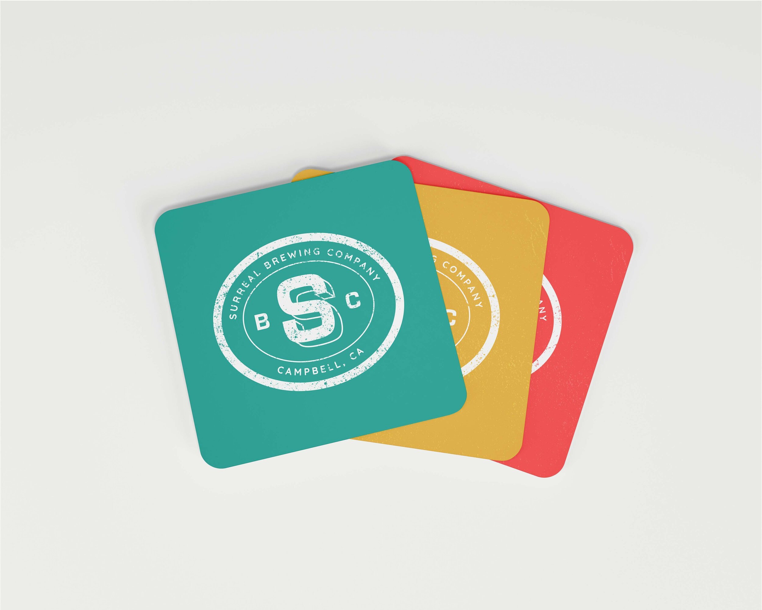
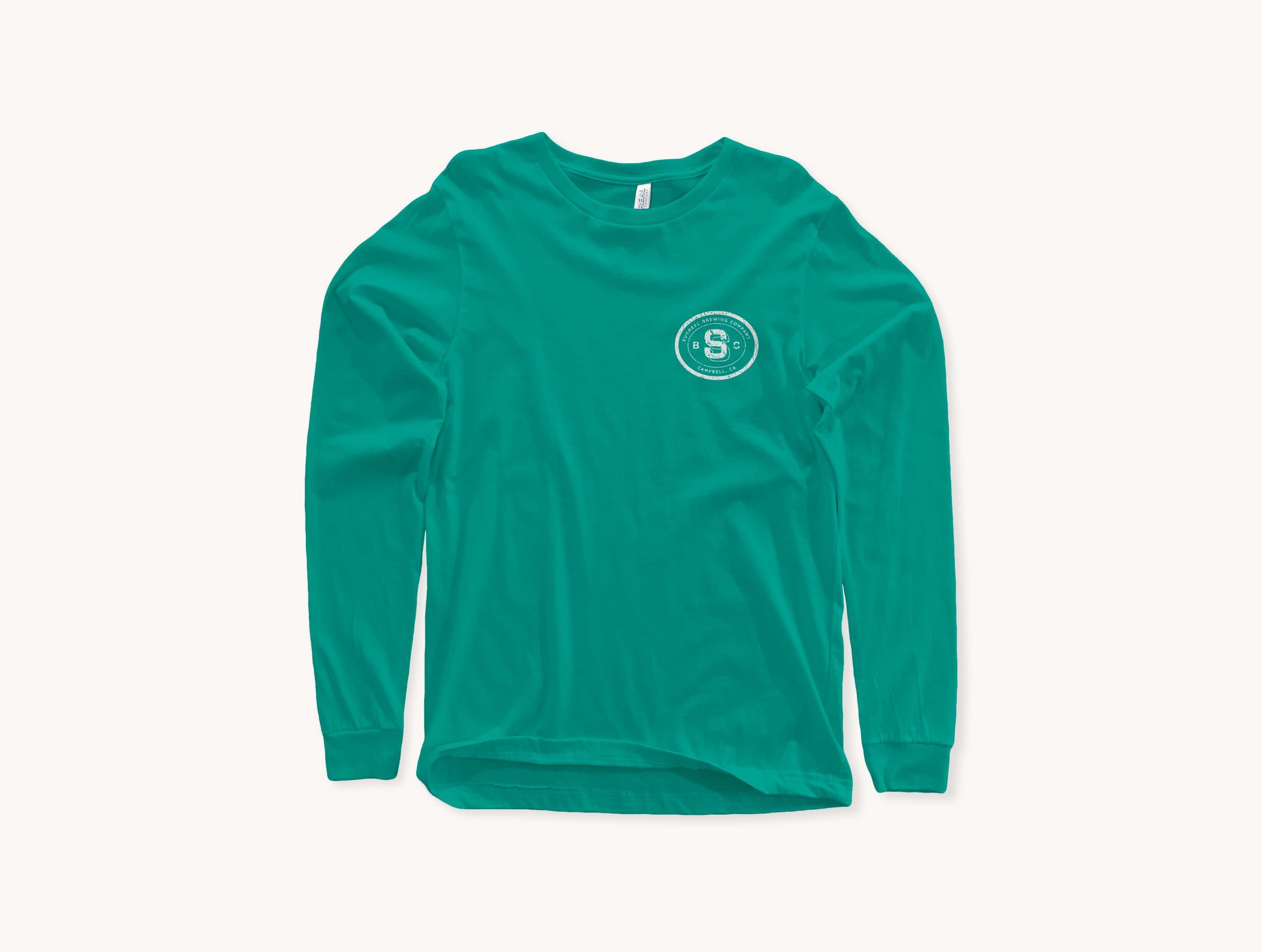
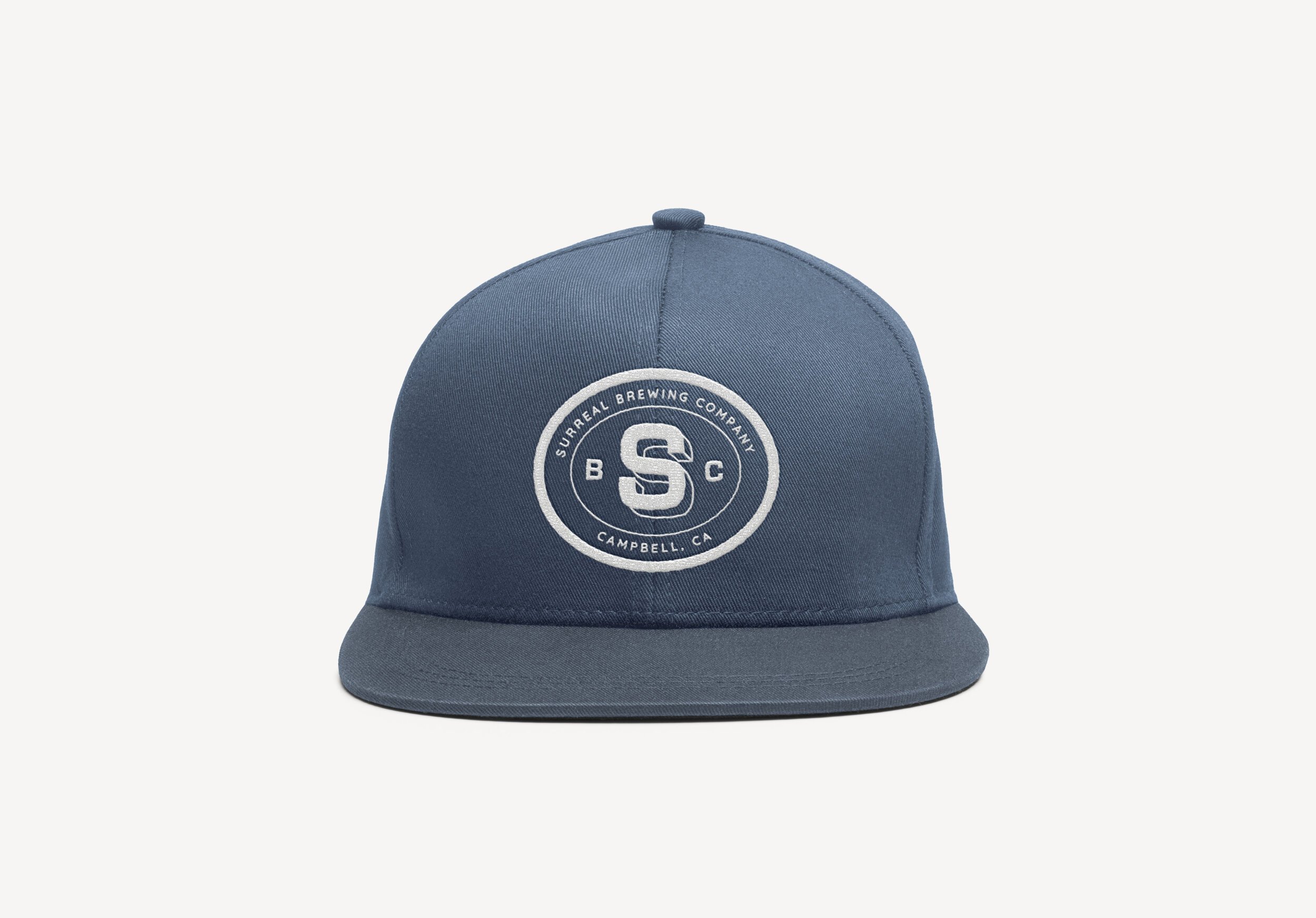
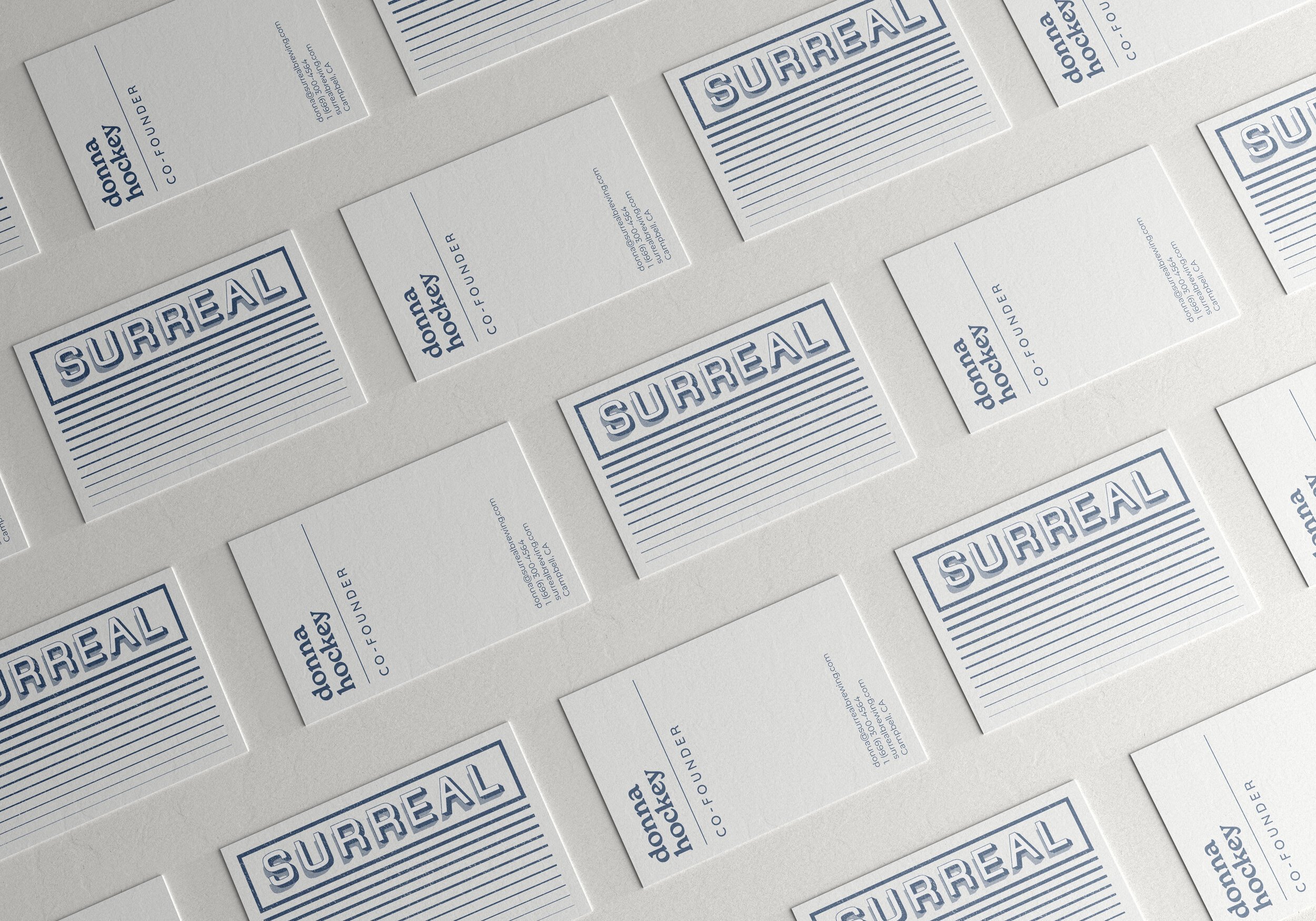
The design of the brand mark for Surreal Brewing is classic and sturdy, drawing inspiration from the hard-core, hard-working people who enjoy their beer. The simplicity of the brand mark allows the personalities and flavors of the beers to shine through on the packaging, as they are the true heroes. The secondary logo, the Surreal Brewing Co. stamp, maintains the handcrafted feel of the primary logo while providing more flexibility. While craft and quality are at the forefront of the branding elements, the typography starts to showcase the groovy and fun personality of the brand and its beers. The California retro vibes of the color palette, along with the funky and geometric shapes and patterning on the packaging, come together in the Surreal Brewing Co. rebrand to encompass all the best qualities that the brand was built on.