Case Study
The FruitGuys is a certified B-Corp that delivers farm-fresh produce, including fruits, vegetables, and clean-ingredient snacks, to homes and businesses nationwide. Founded in 1998, they are a leading provider of fresh produce with a commitment to promoting healthy eating, sustainability, and social responsibility. In addition to supporting local farms, food banks, and the community at large, The FruitGuys also offer educational resources and programs to help individuals and organizations make informed food choices. They strive to foster a sense of environmental responsibility while promoting physical and social well-being, and are dedicated to initiatives such as promoting diversity and inclusion, reducing waste, and supporting local communities.
Fruit Guys
brand identity / packaging / illustration


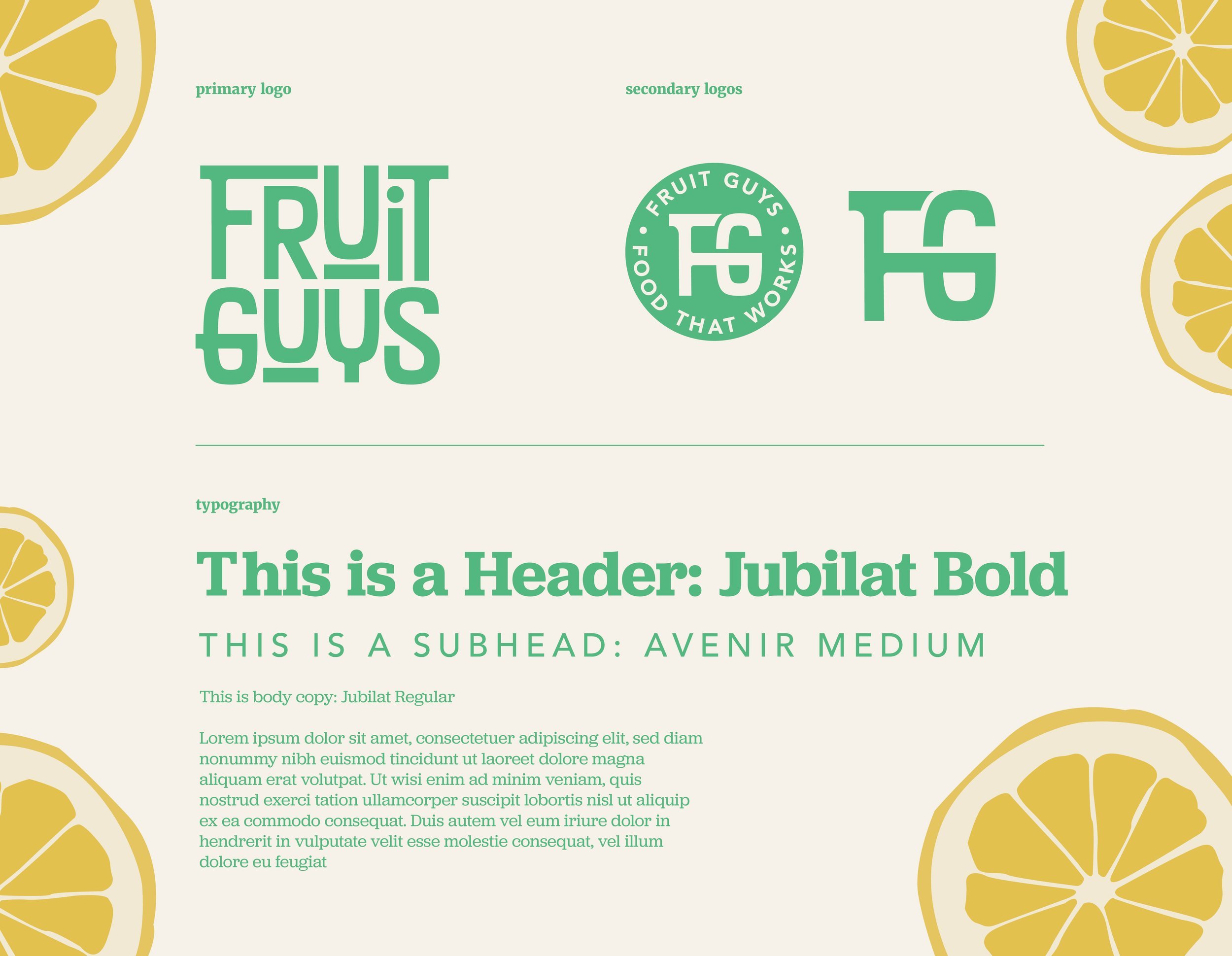
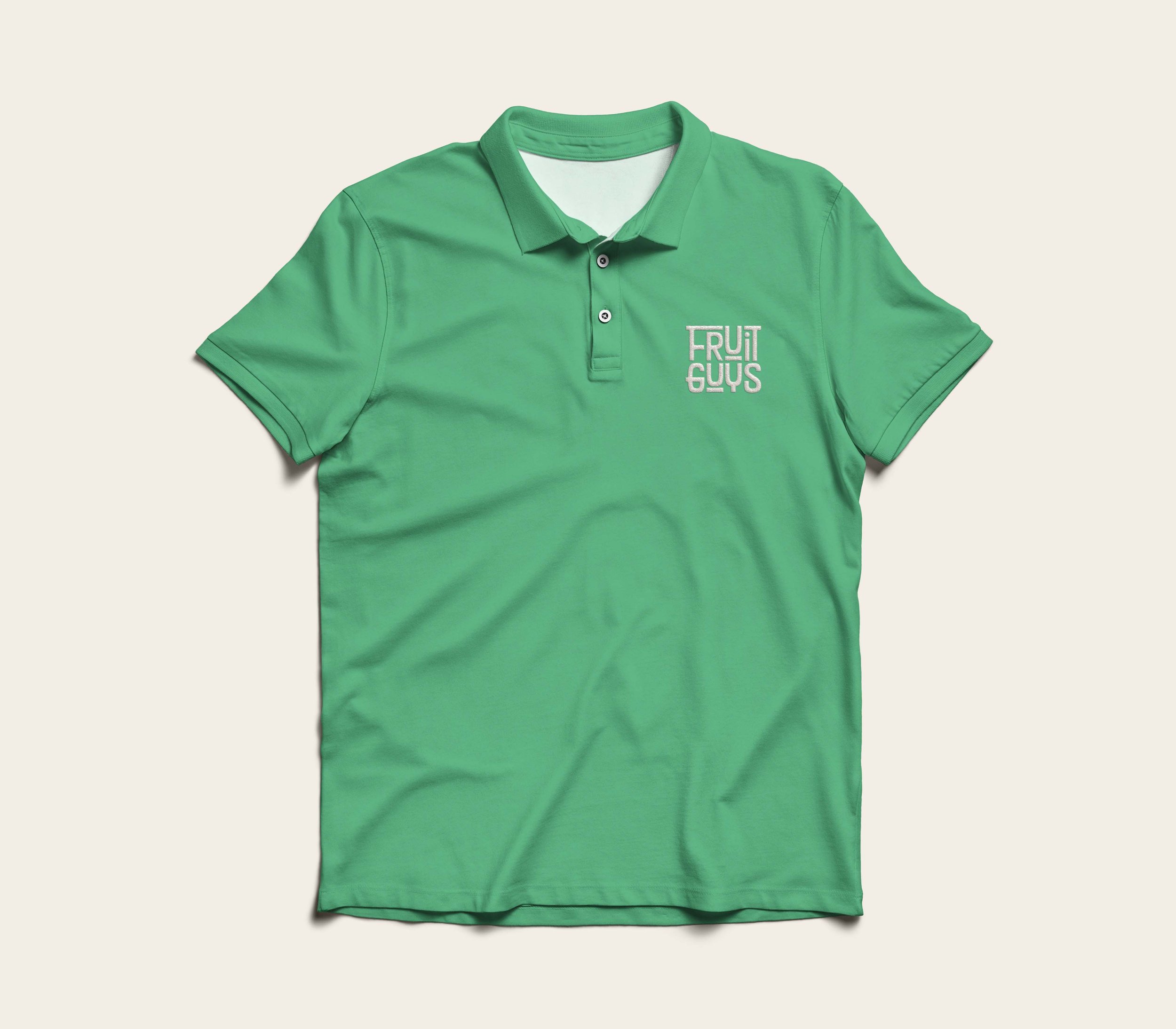
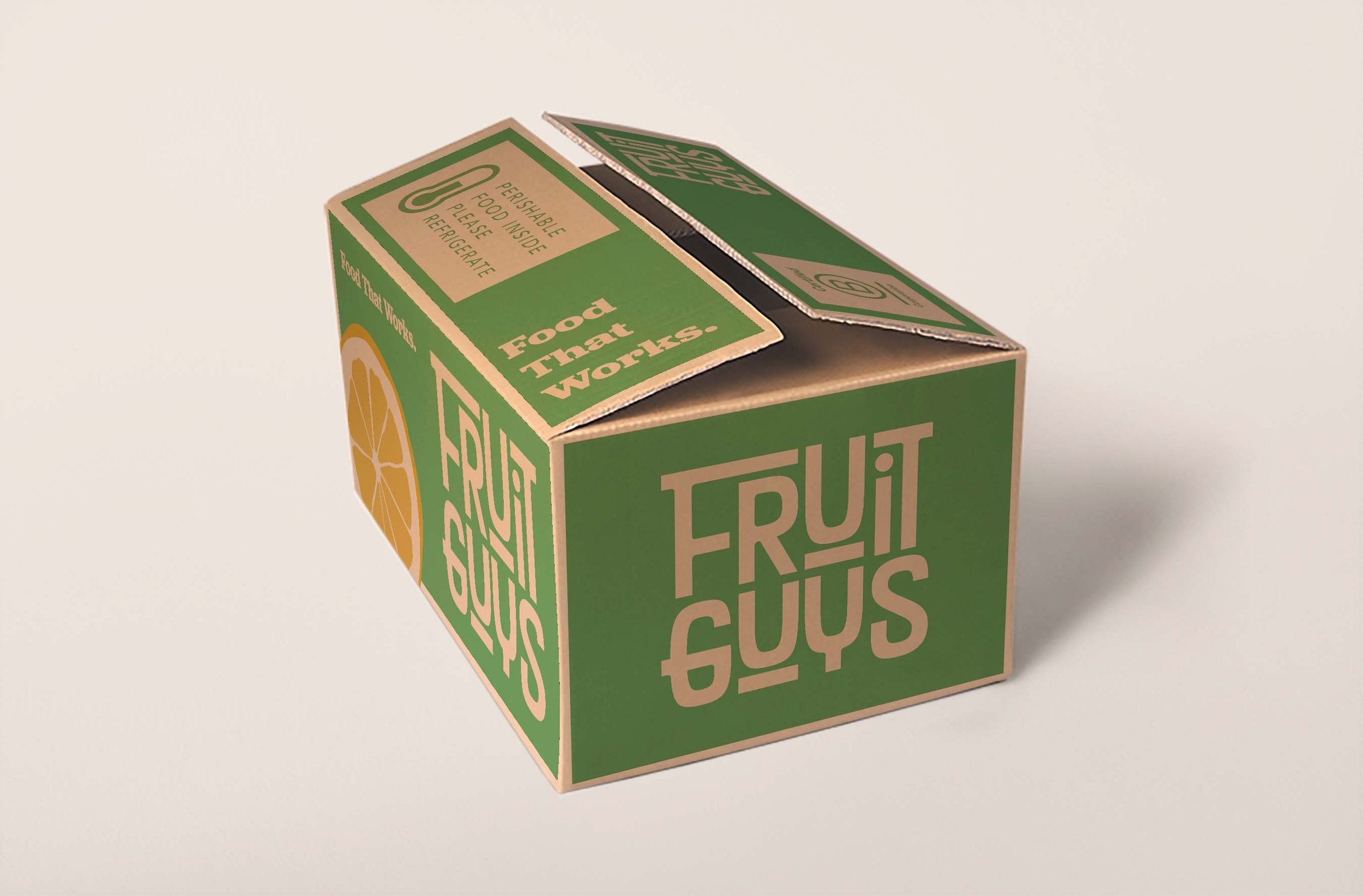
In this project, our goal was to create a dynamic and inviting mark that embodies the warm and friendly essence of the brand. The new logo mark, with its playful yet bold design, reflects how a community comes together, showcasing the brand's values of inclusivity and togetherness.To convey the trusted and credible nature of one of the pioneers in the food delivery service industry, we also developed a brand stamp that complements the primary logo. While retaining its approachable and friendly aura, the stamp serves as a visual representation of the brand's established credentials and reputation.
In terms of typography, we carefully selected a bold slab serif font that adds a touch of playfulness and excitement, balanced with a clean and modern secondary typeface that exudes modernity and professionalism. This combination reinforces the brand's identity as both playful and trusted, positioning the FruitGuys as a relevant and competitive player in today's ever-growing food delivery market.